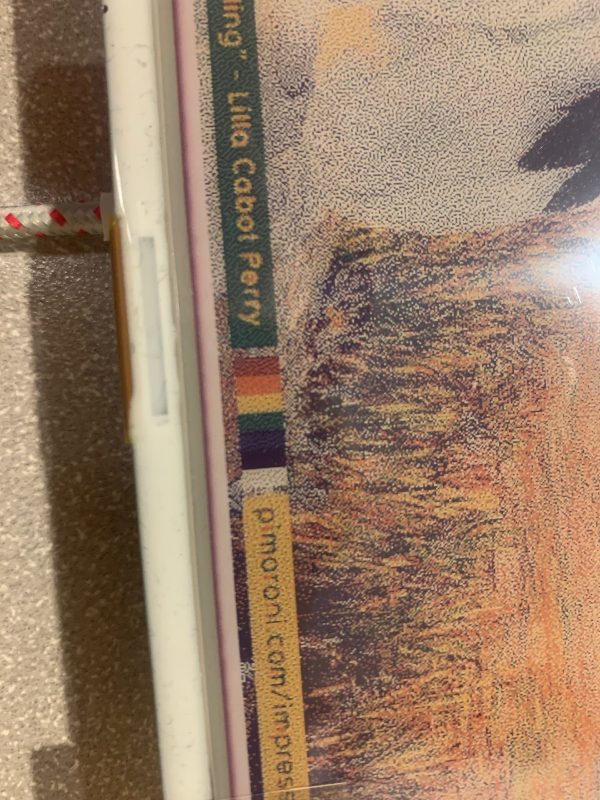
Hi everyone, I recently got an inky impression and was trying some of the examples. With both the logo and image example, it seems like the screen isn’t that sharp, though I can’t tell if it’s because of the image compression or because of the screen.
For example, in the image example, the each color bar doesn’t seem to be completely the same color.
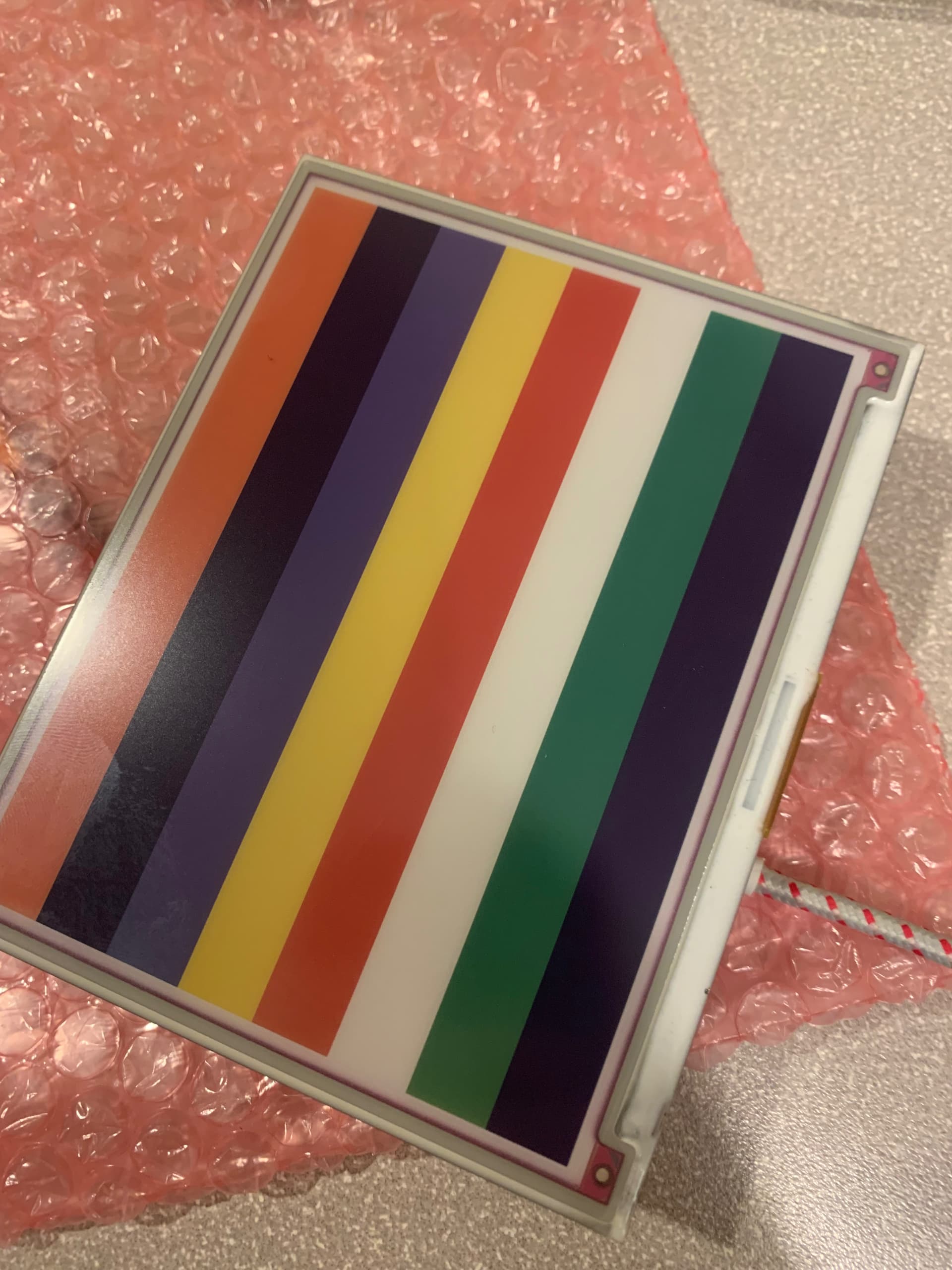
I would say that you’re seeing dithering in that image. To test the rendering of pure colours, you need to encode an image that only uses the 7 colours that the display elements use.
See how this image appears when you display it on the screen:
The dithering is caused by the conversion process trying to approximate certain colours using those in the palette. Perhaps the original image was created with slightly different colours.
If you are creating artwork from scratch, try to use those standard palette colours in your image’s palette. If you are converting images, such as photographs, it’s a little more difficult because you (or the image processing software) will be approximating many colours using dithering and those 7 standard colours. That’s probably fine for many photographs.
If an image has large areas where the colours are similar to those in the palette, but not quite the same, you could process the image so that those areas use standard colours instead. The image will look different to the original, but that’s probably going to be the case, anyway.